NouriFlare
Challenges NouriFlare Faced Before GetRecognize
- Lack of Distinct Brand Identity: NouriFlare needed a strong, cohesive brand that differentiated them from other health food products in the market.
- Attracting Health-Conscious Consumers: The packaging had to convey health benefits while remaining visually appealing on shelves.
- Connecting with a Niche Audience: The brand needed to resonate with an audience focused on wholesome, natural ingredients.
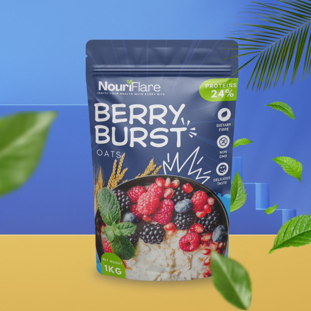
NouriFlare’s “Berry Burst” oats
- Bold, eye-catching blue background with vibrant white typography.
- Fresh imagery of berries and oats for a natural appeal.
- Nutritional benefits like “24% Proteins” highlighted in bright green.
- 3D icons and dynamic graphic elements for added energy.
- Consistent branding with the tagline “Ignite Your Health with Every Bite.”
- Clear, consumer-friendly information with symbols like “Non-GMO.”
Key Highlights
- Designed a fresh, contemporary logo that reflects the brand’s health-focused mission.
- Created a visually appealing and functional packaging design for NouriFlare’s flavored oats.
- Developed a comprehensive branding strategy that helped position NouriFlare as a leader in the health food sector.
Our Solutions:
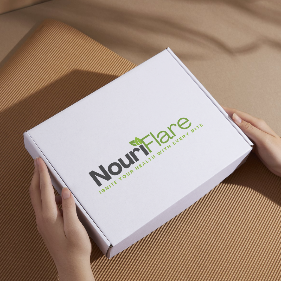
Logo Design: We crafted a minimalist yet striking logo that reflects NouriFlare’s focus on health, purity, and sustainability. The logo uses earthy tones and simple lines to give a fresh, clean look, establishing immediate brand recognition.
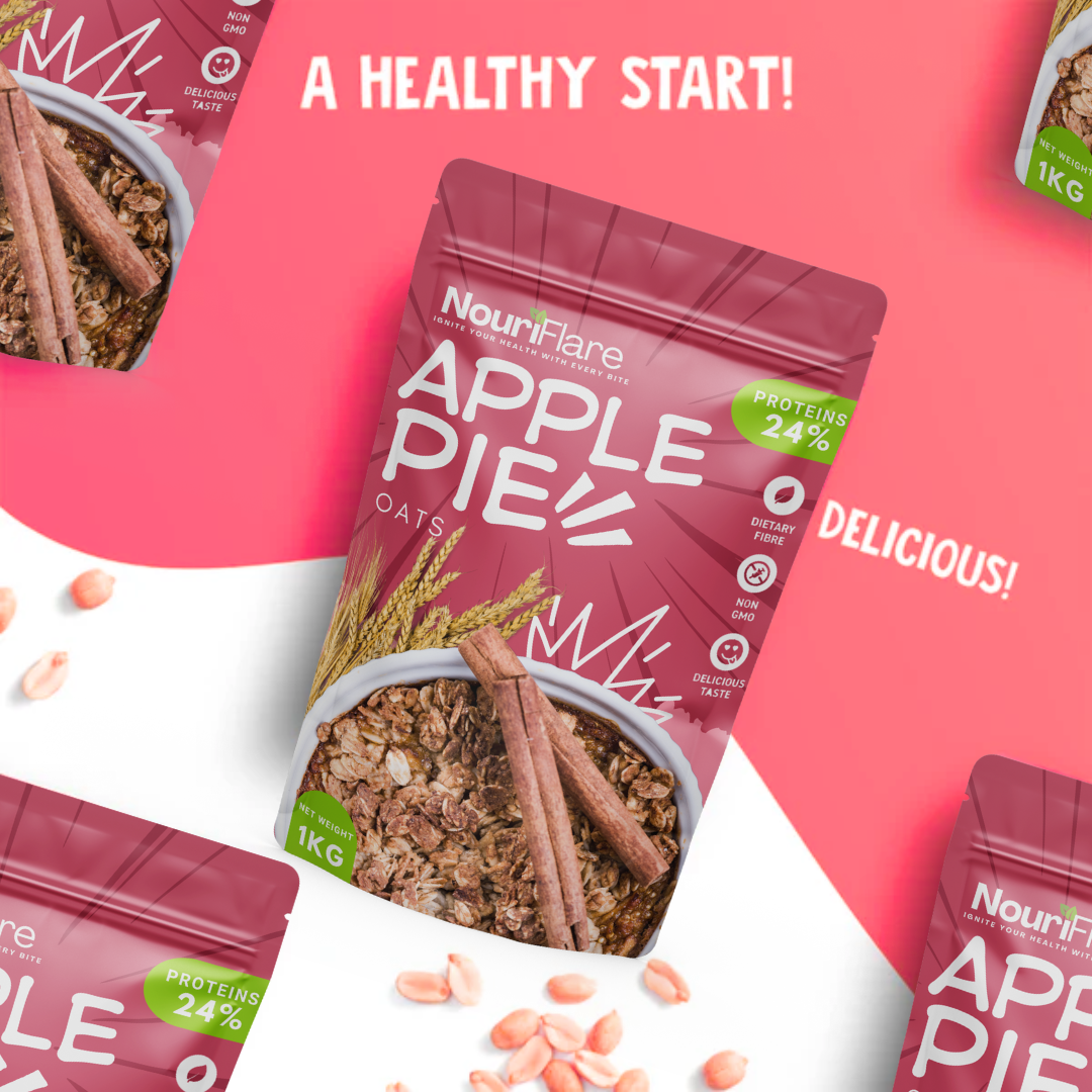
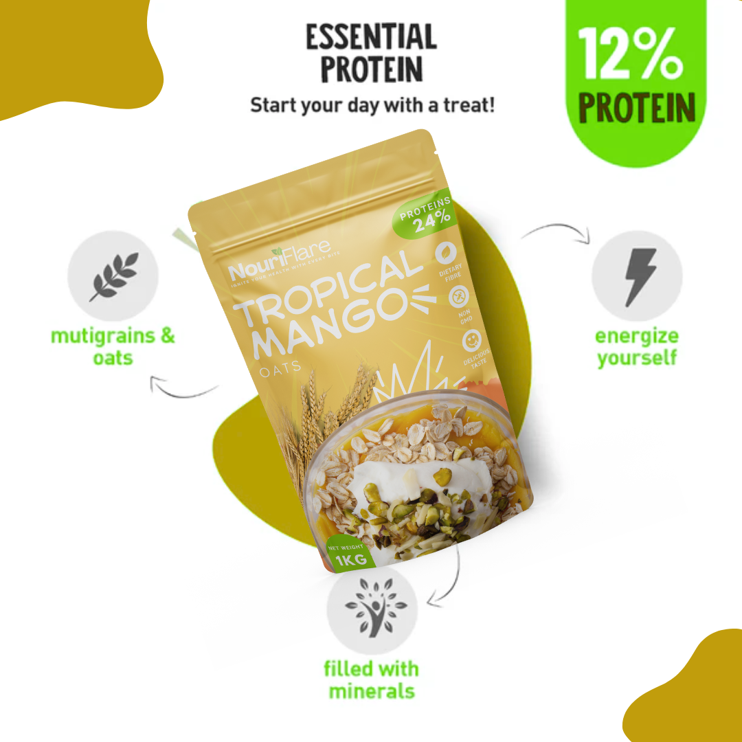
Packaging Design: We developed an innovative and vibrant packaging design for their flavored oats range, using a combination of bright colors and natural elements to capture the wholesome and nourishing qualities of the product. We also emphasized nutritional benefits with clean, easy-to-read labeling.
Branding Strategy: We created a holistic branding strategy for NouriFlare, focusing on the brand’s ethos of health and wellness. This included the use of consistent color palettes, typography, and messaging across all their materials.