loader image

Fruita Valley

Project Overview

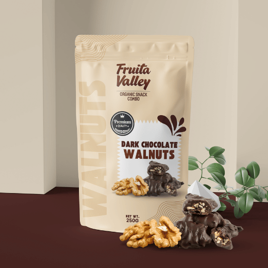
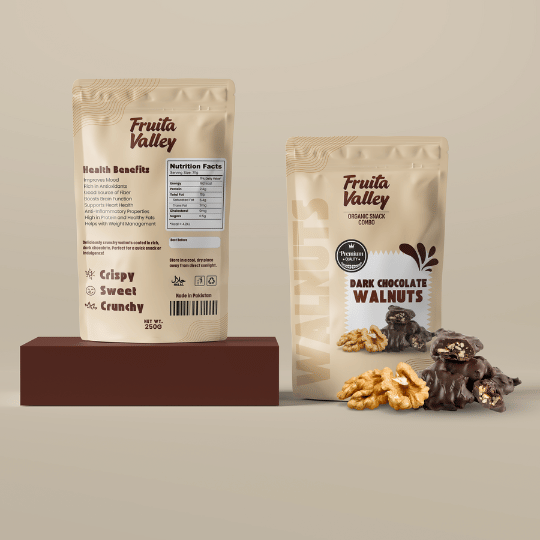
Fruita Valley, a renowned brand specializing in organic snacks, approached us to design packaging for their new premium product, Dark Chocolate Walnuts. Our team was tasked with creating a visually compelling and functional packaging design that highlights both the product’s indulgent flavor and its health benefits, appealing to an audience that values natural ingredients without compromising on taste.


Design Concept

  • Earthy Tones: Reflect the natural, organic essence of the product.

  • Bold Typography: Emphasizes product quality and brand identity.

  • Matte Finish: Adds a premium, sophisticated feel.

  • Realistic Visuals: Showcases the rich texture of walnuts and chocolate for appetizing appeal.

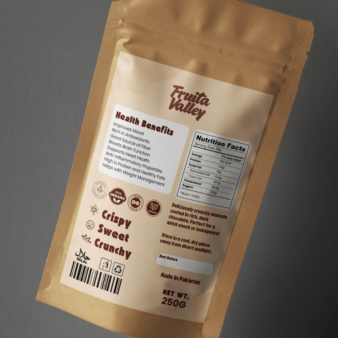
  • Clean Layout: Balances health benefits with an attractive, easy-to-read design.

  • Premium Quality Badge: Reinforces Fruita Valley’s commitment to high-quality, organic snacks.

Key Highlights of the Project:

  • Earthy, natural color palette reflecting organic ingredients.
  • Minimalist typography and layout for a clean, premium look.
  • Realistic walnut and chocolate visuals to enhance product appeal.
  • Transparent information display to build consumer trust.
  • Sophisticated matte finish for a tactile, luxurious feel.

Why This Design Works:

This packaging design balances indulgence with health, appealing to customers looking for a delicious yet natural snack option. By combining organic elements with a modern, minimalist layout, the packaging not only stands out on shelves but also conveys Fruita Valley’s brand values of quality and authenticity. Every aspect of the design—from the earthy color scheme to the matte texture and clean typography—was chosen to enhance the user’s experience and create a strong visual identity for Dark Chocolate Walnuts.